Free Ground Shipping on Orders Over $49 Details & Exclusions Excludes Curb Side Delivery (LTL). Lower 48 United States Only.
Mar 14, 2019
What is Mid-Century Modern? The Ideas Behind the Design
Traditional design is timeless by nature. The word ‘traditional’ actually means “long-established,” or “habitually done.” So when you shop traditional lighting, you know you’re going to find a fixture that could potentially outlast your home. But when someone says “mid-century modern,” do you know what they mean?
The phrase “mid-century modern” was first coined by author Cara Greenberg in 1984 when she used it in the title of her book, Midcentury Modern: Furniture of the 1950s. She literally made up the term. But because her book was such a hit, “midcentury modern” became a hit, too – and not just as a catchy descriptor.
Mid-century modern also has a uniquely timeless quality that seems to have found its place in every decade since the ‘60s. Because this design style has evolved and transitioned so well with the times, you might be left wondering: What is mid-century modern design and where did it come from?
We’re so glad you asked.
What is Mid-Century Modern Design?
Mid-Century Modern Influences
When it comes to design, mid-century refers to the period of time between the mid-1930s and mid-1960s. While some would argue mid-century is limited to 1947 to 1957, they would be forgetting one of the major influences on this design: the Bauhaus style.
The Bauhaus was an art school in Germany that taught a balance of art and technical craftsmanship. Students of Bauhaus focused as much on functionality as they did aesthetics. They defiantly dismissed luxury living and, instead, designed for the masses.
By the mid-1930s, tensions were rising in Germany and the Bauhaus school was forced to close. Those who studied there migrated to other countries, some even making it to America. With them, they brought the Bauhaus sensibility.
The minimalist feel and geometrical forms that characterized Bauhaus style flowed right into the modern movement, which took hold in the post-World War II era. By the late 1940s, the U.S. economy was booming and cities were growing.
Not to mention, there was a wave of technological advances that led to the development of new materials. As a result, industries like architecture, furniture and graphic design started introducing an array of textures, colors and forms. Alas, mid-century modern was born.
Mid-century Modern Ideals
Mid-century modern design was built on several important ideals, which stem from the Bauhaus style and post-war modernism. Indeed, there is some carryover from the art deco period. But you’ll notice that furnishings and fixtures are far less glamorous in the mid-century, staying true to its democratic, design-for-all roots. Here are some those key concepts:
· Functionality comes first and form second.
· Simpler is always better.
· Use minimal embellishment, at best.
· Mix materials to create interest.
Mid-Century Modern Designers
From the Nelson bench to the Eames chair, there are many great names that have become synonymous with mid-century modern design. Some names you may see time and again, include (but are certainly not limited to):
· Charles Eames and his wife Ray Eames
· Eileen Gray
· Arne Jacobsen
· Florence Knoll
· George Nelson
· Isamu Noguchi
· Eero Saarinen
Mid-Century Modern Elements
When shopping for a mid-century modern home, you can expect décor to have an organic quality about it. At the same time, you’ll notice lots of clean lines and geometric shapes.
Materials:
· Light-colored wood, including beech, elm, oak, rosewood, and teak
· Metals like brass and chrome
· Clear glass
· Plastics like Plexiglass
· Vinyl
Colors:
· Neutrals, particularly shades of white, and gray
· Pops of earthy colors, like avocado green, deep-ocean blue, or mustard yellow
Shapes:
· Geometric
· Abstract like a Pollock painting
· Atomic or star-like
Characteristics of Mid-Century Modern Lighting
To fit into a mid-century modern home, a light fixture must feel artsy in an airy kind of way. It can’t clutter the headspace, which is why you’ll see a lot of thin, straight lines and neutral color tones. The metals are usually on the warmer side, such as brass or bronze. The occasional shiny chrome isn’t uncommon, either. After all, it is a shade of gray that feels light and sterile.
To achieve that beautiful sense of artistry, you’ll find a lot of geometric designs in mid-century modern lighting. The basic shapes are wildly popular; think squares, rectangles, triangles and circles. But don’t be surprised if you also see those funky starbursts that are so distinctive in art deco lighting. They lasted well into the 1960s, and no one’s complaining about it.
8 Mid-Century Modern Light Fixtures We Love
You have been officially schooled on mid-century modern design from top-to-bottom, front-to-back. Now let’s see if you can spot the distinguishing elements in action. Below are eight mid-century modern light fixtures that speak of simpler times but, somehow, still conform to 21st century standards.
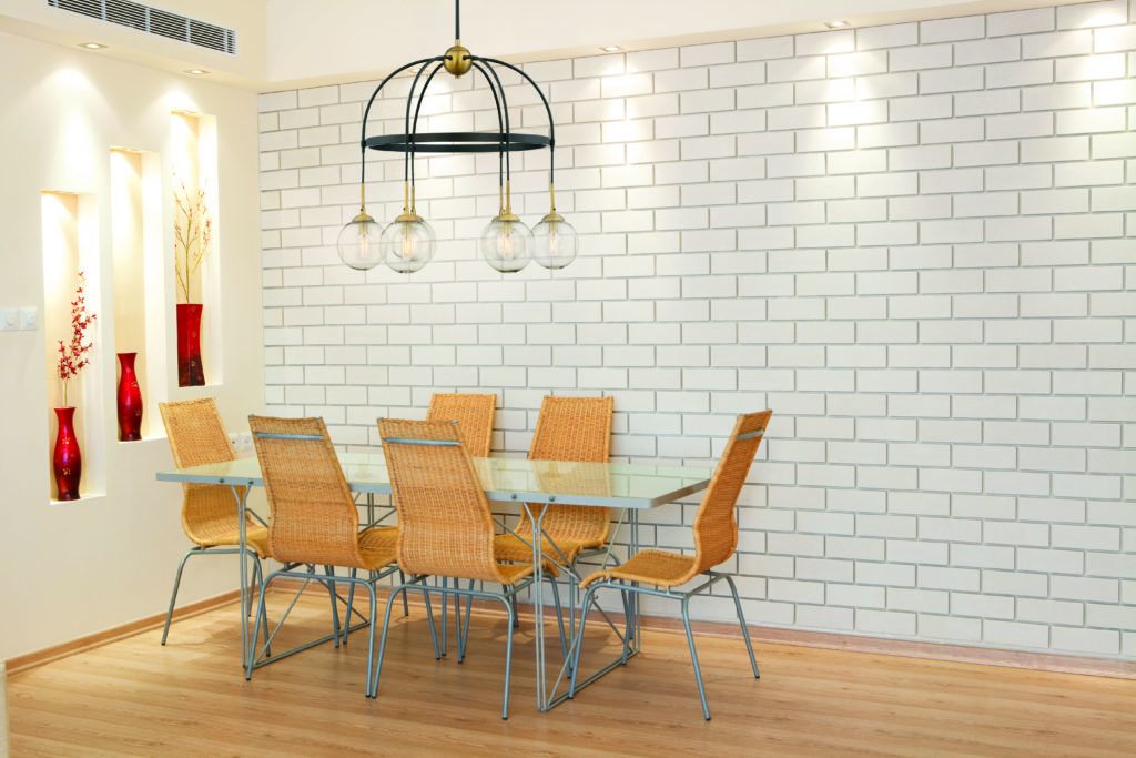
1. Fulton Chandelier by Savoy House
Around and around, you go. This carousel-inspired chandelier is an endless circle of circles. From the top brass finial to the glass globular bulbs, there is a sweet repetition of geometry. You’ll also notice the mix of contrasting materials – glass, brass and bronze – which lends that artful quality. Everything about this unique chandelier suggests you should hang it like a mobile above your main dining area.
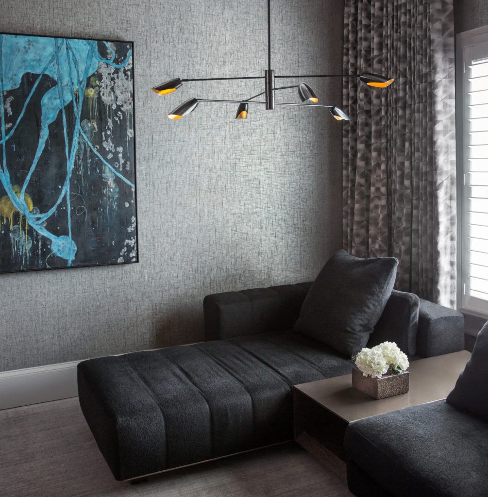
2. Bowery LED Chandelier by Frederick Ramond
Like mid-century modern furniture, this chandelier floats in the room. You’d barely notice it if it weren’t for the six LED can lights. They cast adequate, energy efficient light at all hours of the day. Best of all, the arms pivot, so you can adjust the lighting to suit your needs. If that kind of functionality doesn’t satisfy mid-century ideals, what does?
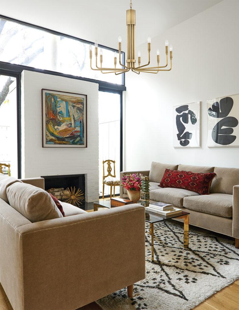
3. Brigette Chandelier by Mitzi
Don’t let the candelabra base fool you. The Brigette chandelier is 100-percent modern, thanks to those slender arms and exposed light bulbs. This is a pure, no-fuss fixture, but it still manages to make a statement. While the aged brass finish is stunning and blends with a neutral color palette, the polished nickel works well in a more contemporary space.
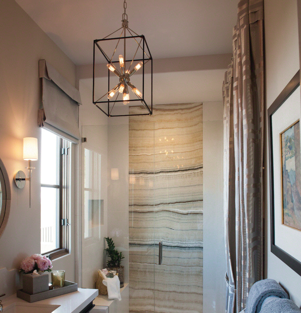
4. Glendale Cage Pendant by Hudson Valley Lighting
This is a unique combination design with its sputnik core and dark, metal cage. While cages are common in rustic lighting, this particular framework doesn’t feel unfinished in any way. In fact, the framework is so thin, it’s borderline fragile. It serves as an outline that punctuates the interior starburst. You’ll certainly want this eye-catching pendant in a prominent place, where you can enjoy it every day.
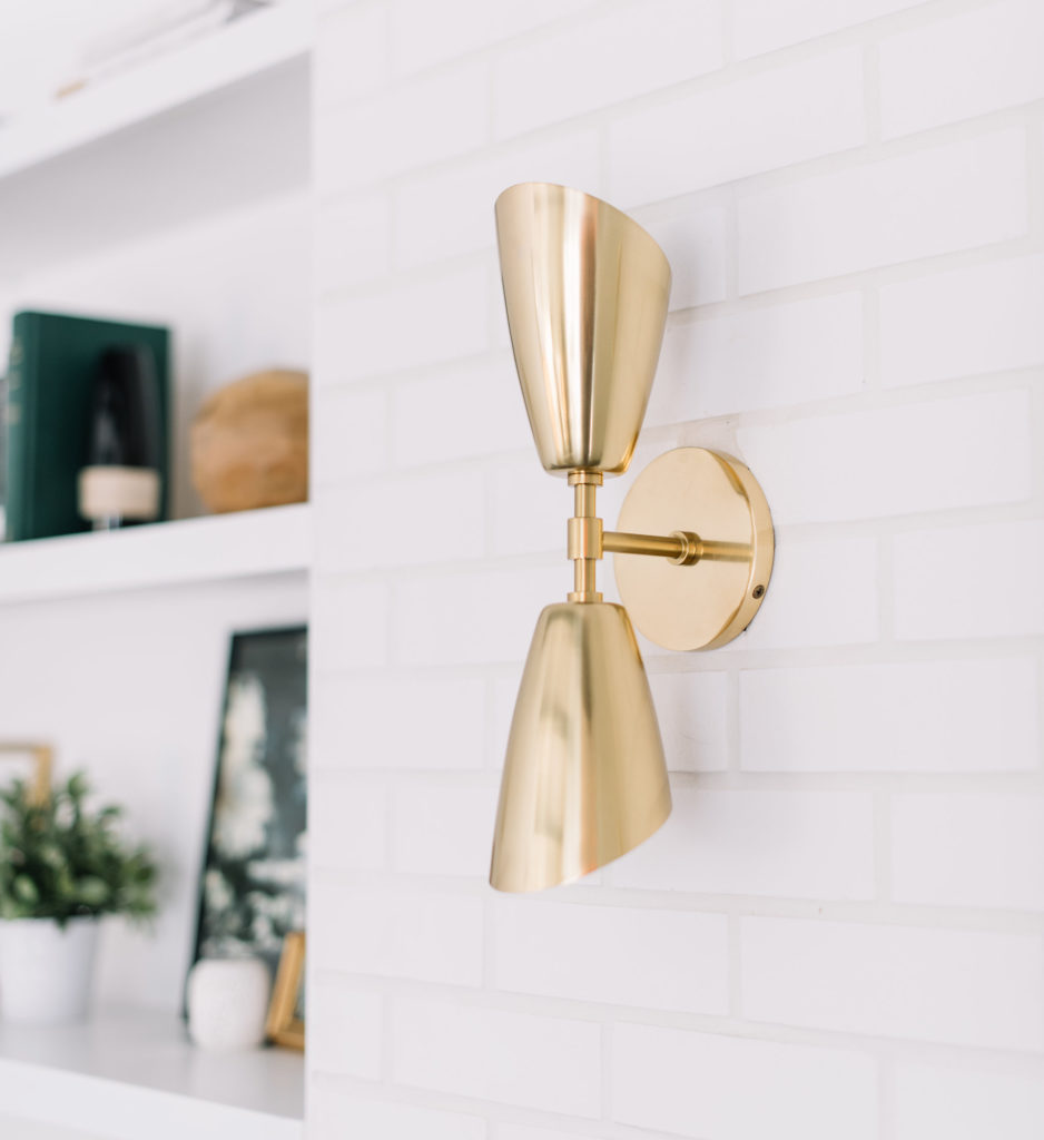
5. Kai LED Wall Sconce by Mitzi
Form, meet function. While wall sconces typically shine light up or down, this one does both. It’s a worker bee, trying to provide the most light for your fixture. As far as form goes, you can’t help but appreciate the linear design that keeps your space clear of visual clutter. The vertical arrangement also does a nice job of framing certain features of your home, like a built-in bookshelf or piece of modern art.
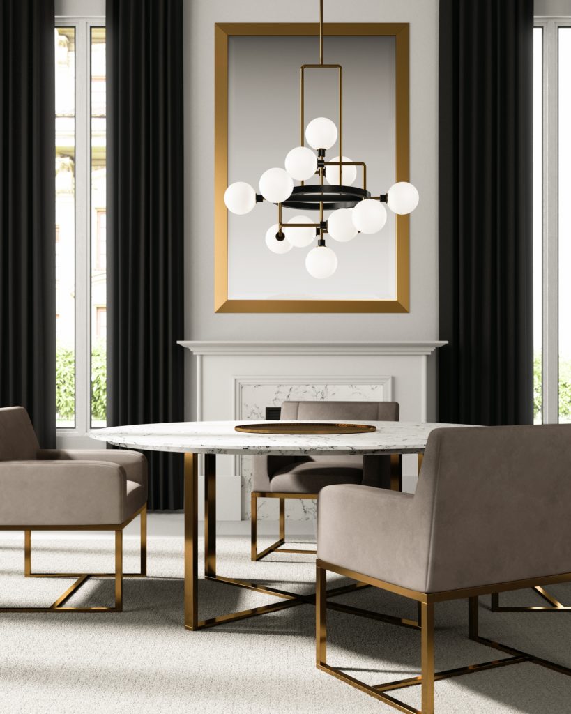
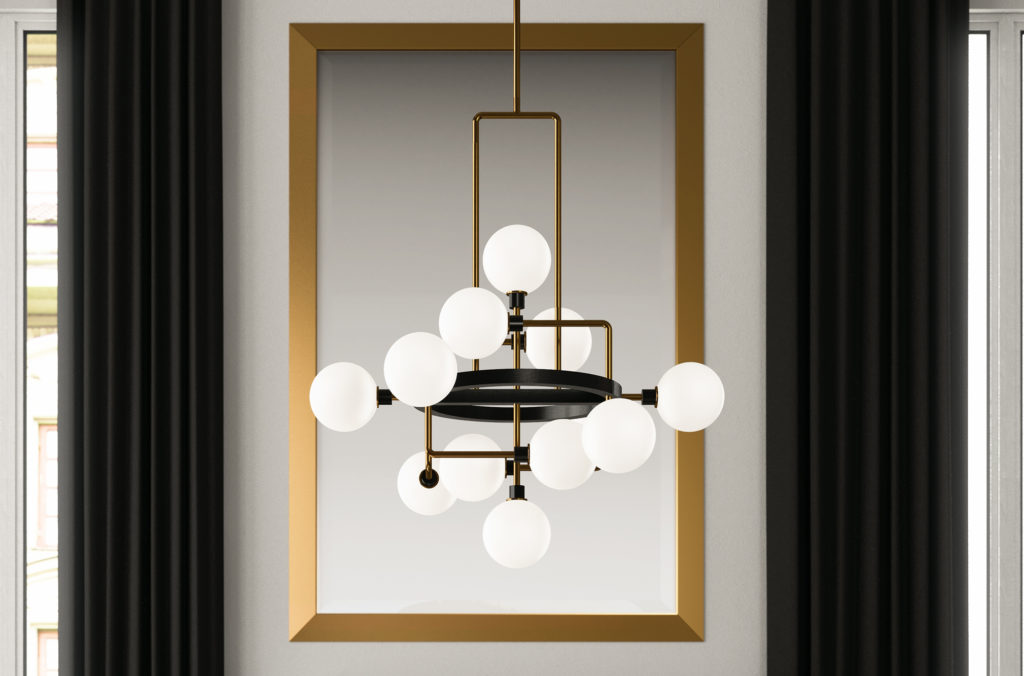
6. Viaggio Chandelier by Tech Lighting
If you love everything about mid-century modern design, you’ll love everything about the Viaggio. It has geometry, contrasting materials, earthy neutrals and one of the most eye-catching forms you’ll ever see in a light fixture. While it is not a simple design, it’s made of simple shapes and lines that come together in the perfect formation. Make sure this piece gets center-stage in your home.
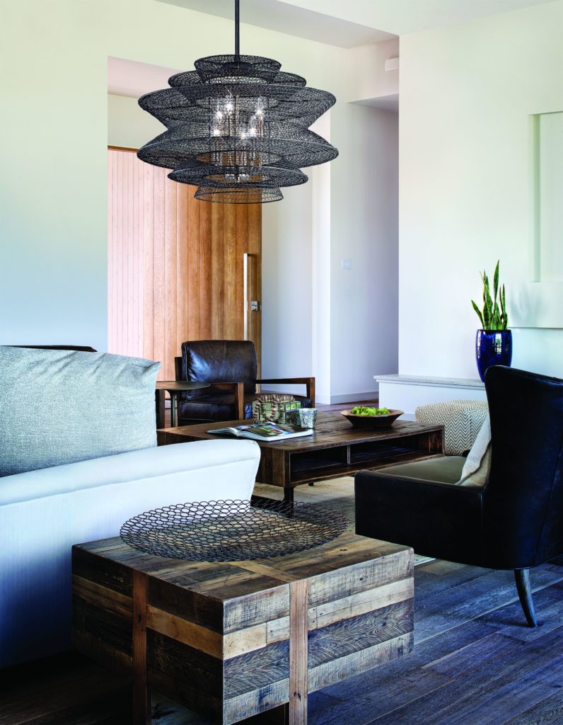
7. Kokoro Pendant by Troy Lighting
The Kokoro may not be the textbook definition of mid-century modern, but it complements the design style in a surprising way: It has texture. Usually, texture in a mid-century modern home comes from rugs or wallpaper, but there’s no rule against adding it overhead. Besides, it has a beautiful woven design, which keeps this pendant nice and airy – almost like a paper lantern.
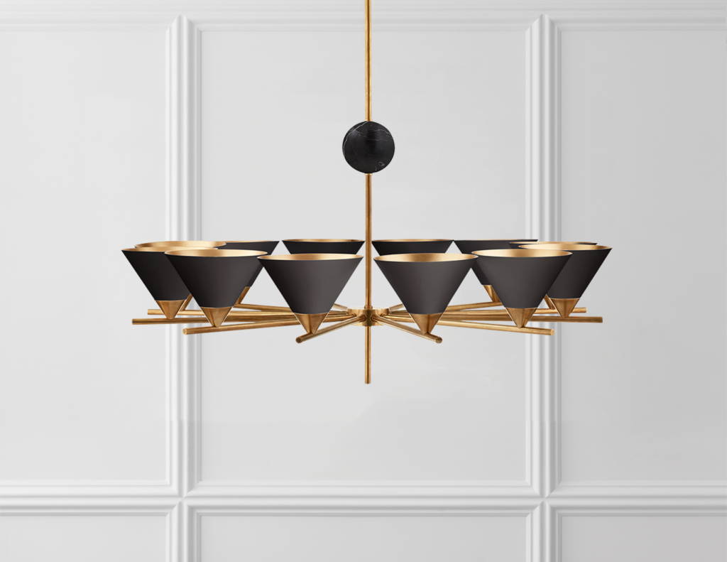
8. Cleo Chandelier by Visual Comfort
The Cleo’s pinwheel design is a nod to the quirky side of mid-century modern, though it also has an atomic quality to it. Meanwhile, you still get an ample serving of sleek and simple. For example, the black triangular lamp shades are made with precision geometry. And you can’t miss the thin, straight line that suspends it from the ceiling. Because of the warm glow that bounces off the brass, this chandelier deserves a spot in your formal dining room.
Spark Some Interest
Mid-century modern is one of those interior design styles that can integrate into any time period. Most likely, that’s thanks to its roots in minimalism and the designers’ decision to choose function over form. Regardless, you can count on mid-century modern lighting and décor to remain a staple for years to come. So don’t be afraid to incorporate it into your home.
When you choose any of these contemporary examples of mid-century lighting, you’ll spark some interesting conversation at your next dinner party. Guests may even start to ask: “what is mid-century modern?” Not only will you have the light fixtures to exhibit, but you’ll have the knowledge to back it up. The next thing you know, your friends and family are coming to you with all their design questions.

