Free Ground Shipping on Orders Over $49 Details & Exclusions Excludes Curb Side Delivery (LTL). Lower 48 United States Only.
Dec 31, 2015
2016 Color of the Year
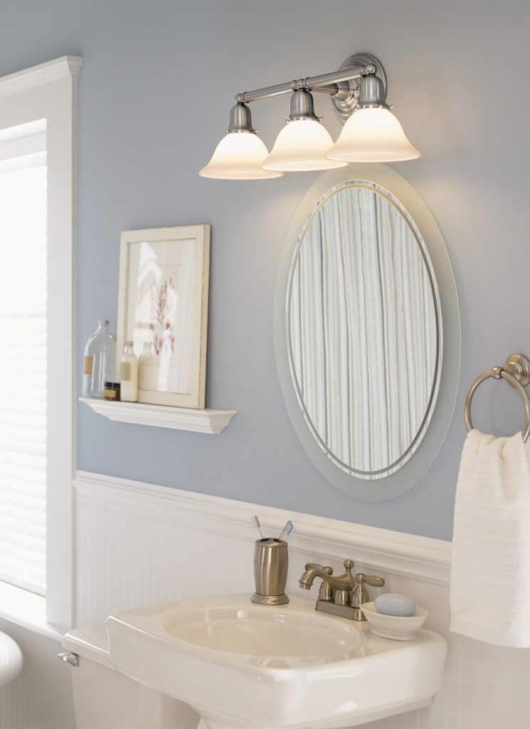 Featured: Sea Gull Sussex Vanity Light
Light Up with PANTONE’S Color of the Year
Bonding together and intermingling with ease, PANTONE’S chosen colors for 2016 are an eye-appealing synergy—blending metals, textures, and color! These serene and tranquil hues are a perfect blend to play up and accentuate the beauty in your home.
For the first time, PANTONE’S Color of the Year is a pairing of two shades: Rose Quartz and Serenity. This easeful combination unites subtle energies along the temperature spectrum, as Rose Quartz is considered a warm tone and Serenity, a cool blue.
This gentle fusion of color is breaking down barriers, mixing both glossy and matte finishes, and translating well into decorative interior design.
Color & Light
The right combination of ambient, task and accent light is the key to unlocking the delicate nuances, textures and brilliance in this color palette.
Be sure to select your light sources with the right correlated color temperature (CCT). Designated in Kelvin (K), CCT for decorative interior lighting applications should fall within the “warm white” range between 2700-3000K. For cooler room colors, sometimes lighting in the neutral white (3500-4000K) is preferred. With a variety of bulbs available, it’s best to know which one will work best for your home and desired look.
Know Your Bulbs
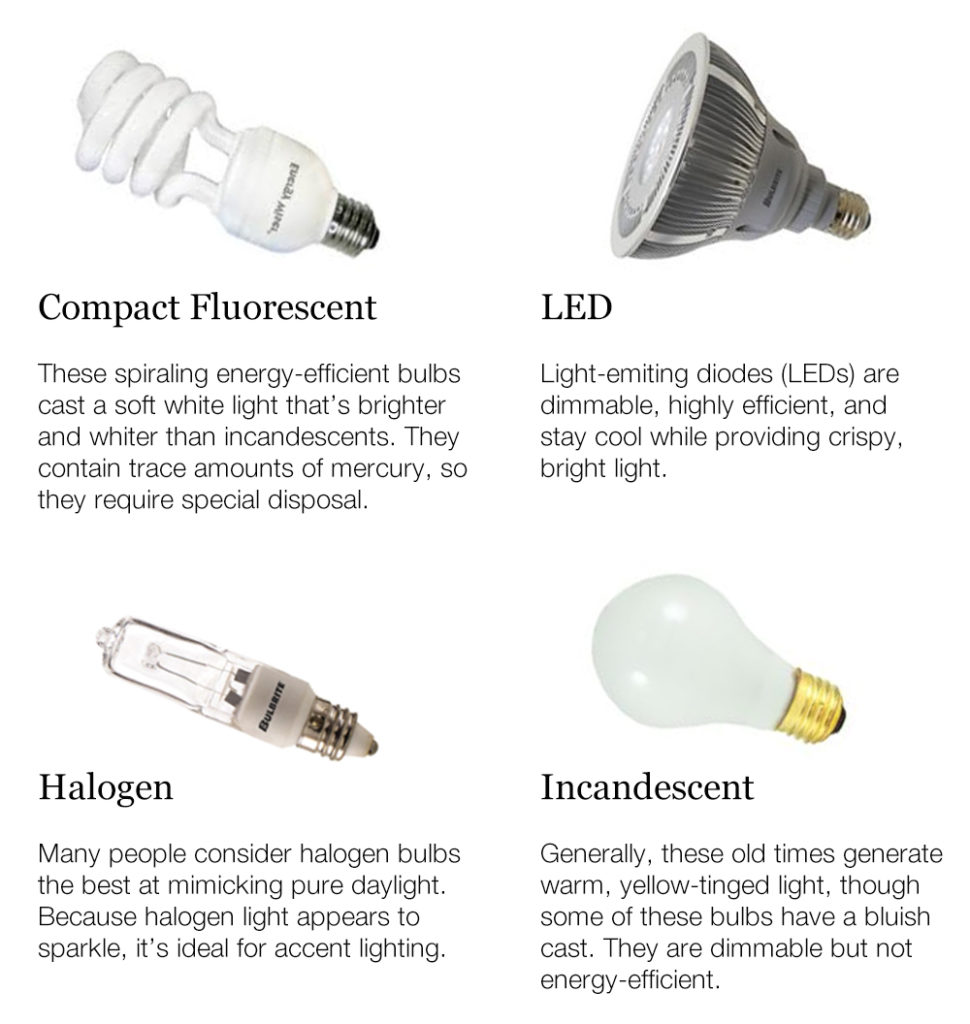
Working with color and light to accentuate the decorative elements in your décor is truly an artform–so a bit of trial and error is the best way to tweak your design and compose the perfect symphony of illumination, furnishings and accessories.
When picking a color, don’t forget to factor in the light! Different times of natural light and the bulbs you choose will affect the look of the color in your home. Be sure to test paint colors on your wall at various times during the day and then again at night with just the artificial light. This will help ensure you love the color no matter the time of day!
About PANTONE’S Color of the Year
The color of the year selection involves an extremely diligent process determined by PANTONE LLC, a subsidiary of X-Rite, which has been the world’s color authority for more than 50 years. Dedicated to the science and technology of color, PANTONE’S research has helped promote a passion for the way color influences our mood, appearance and attitude.
Create a serene space with PANTONE’S 2016 color of the year
- Rose Quartz: gentle tone, compassion, a sense of composure
- Serenity: weightlessness, airy, expanse of the blue sky, feelings of respite, relaxation
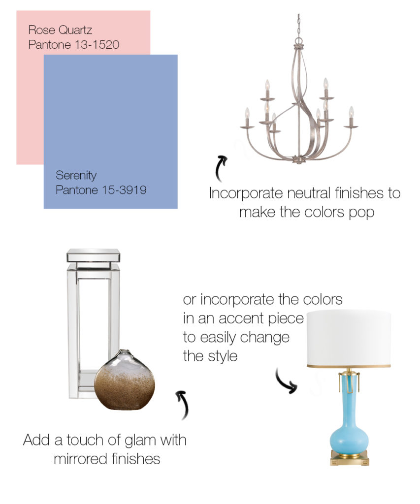 Featured: Quoizel Serenity Chandelier // Frederick Cooper Blue Eden Table Lamp // Cyan Design Russet Vase // Howard Elliott Pedestal

